Mobile Publishing is designed to help your customers find you from anywhere, anytime.
This functionality allows you to optimize your LinkskyVISUAL site and publish it specifically for viewing on mobile smartphones. The mobile template includes prominent calls-to-action, such as click-to-call and maps, and elegantly tailors your website's look and feel for the mobile browsing experience. It is also integrated with the LinkskyVISUAL Online Store, allowing your customers to transact directly from their mobile phones.
Here are some of the features available:
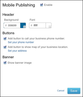
- You can change your header's background color and font, to differentiate it from your non-mobile-optimized site.
- One-touch buttons:
- You can add a button for customers to call you instantly, without having to scroll through your site.
- You can add a "Map" button to display a map to your business, making it easier for customers to find you.
- You can choose whether to display your site's banner image on your mobile-optimized site.
Updating your site automatically updates your mobile site without you having to worry about it, allowing you to focus on running your business. Here's how to set this up:
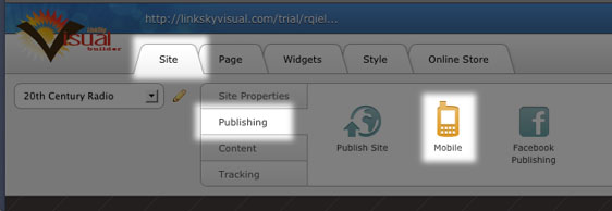
1. To access Mobile Publishing, go to Site > Publishing > Mobile. The dialog box contains a preview version of your site, so you can see what it will look like on a mobile phone.

2. To enable Mobile Publishing, click on "Enable" in the top right corner of the Mobile Publishing settings box.

3. Click "Save" to save your changes.
4. To publish your website for a desktop browser and mobile-optimized site, click "Publish".
5. Both versions of your site will be published.
Once you have enabled mobile publishing, the mobile version of your site will automatically be updated every time you republish your site.
Please note: Your site might display slightly differently on some phones due to different resolutions and screen sizes.
Comments
0 comments
Please sign in to leave a comment.